CSS Glassmorphism Generator & Frosted Glass

CSS Glassmorphism Generator & Frosted Glass

Generate modern CSS glassmorphism & frosted glass UI code with live backdrop-filter blur, opacity, border, and shadow controls. Copy clean HTML and CSS instantly.

Load sample
Sec controls
16px
0.18 (82% Stat transmittance)
#FFFFFF
1px
0.25
135°
140%
Level 3
Lbl noise opacity5%
Preview card title
Preview card subtitle
Preview live badge
Preview balance
82%(16px Unit gaussian)
Preview card holder title
Preview card holder name
Preview expiry title
Preview expiry date
Lbl card width:440px
Lbl card height:270px
Stat blur16px
Stat transmittance82%
Stat contrast ratio10.23:1
Stat css size521 B
Stat vendor prefix-webkit- ON
Stat gpu bandwidth57 MB/s
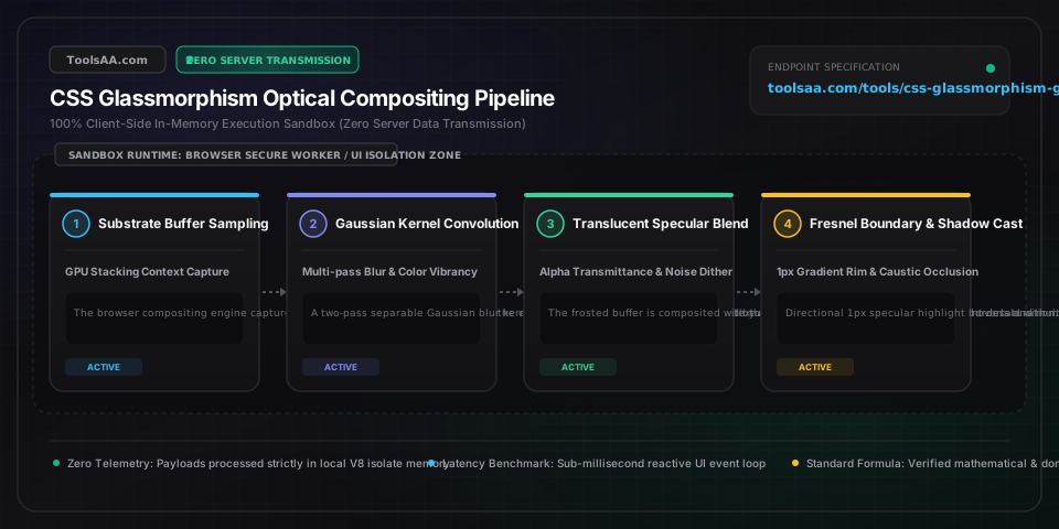
Technical Reference & Architecture Guide

CSS Glassmorphism Generator & Frosted Glass Guide

Generate modern CSS glassmorphism & frosted glass UI code with live backdrop-filter blur, opacity, border, and shadow controls. Copy clean HTML and CSS instantly.

CSS Glassmorphism Generator & Frosted Glass Guide — Client-Side In-Memory Architecture & Data Flow

Key Parameters & Controls

backdrop-filter: blur(px)CSS Length (px)

Controls the standard deviation Gaussian convolution radius of background pixels directly underneath the element. Benchmark safe range is 8px to 24px; values above 32px trigger significant GPU rasterization fill-rate bottlenecks on low-power mobile devices.

Default: 16px
-webkit-backdrop-filter: blur(px)CSS Vendor Property

Mandatory WebKit engine vendor prefix required for Apple Safari (iOS Safari and macOS Safari). Omitting this vendor prefix causes complete blur failure in Safari, leaving the card as a flat translucent polygon.

Default: 16px
background: rgba(R, G, B, alpha)CSS Color Translucency

Governs the base substrate tint and light transmittance. Gold standard alpha interval is 0.10 to 0.35 for dark glass and 0.25 to 0.70 for light frosted glass; exceeding 0.75 eliminates background refraction, while dropping below 0.08 destroys structural contrast.

Default: rgba(255, 255, 255, 0.18)
border: 1px solid rgba(255, 255, 255, alpha)CSS Border Specular Highlight

Simulates optical Fresnel rim reflection where glass edges bend ambient incident light. Best results use a semi-transparent 1px border with an alpha between 0.15 and 0.40, or a directional linear gradient fading from light to dark.

Default: 1px solid rgba(255, 255, 255, 0.25)
backdrop-filter: saturate(%)CSS Filter Percentage

Compensates for the desaturating optical side-effect of Gaussian blurring. Boosting saturation between 120% and 180% restores chromatic vibrancy and prevents blurred backgrounds from appearing dull or chalky.

Default: 140%
feTurbulence SVG Micro-NoiseSVG Filter / Data URI

Applies procedural fractal noise grain over the frosted surface. Eliminates severe 8-bit stepped color banding gradients across blurred backgrounds on standard sRGB displays and reproduces tactile physical acrylic texture.

Default: opacity: 0.05

Pro Tips & Best Practices

Directional Specular Highlight using Linear Gradient Border

Real physical glass reflects light unevenly depending on the primary light source angle. Instead of a flat border, apply a directional gradient border using border-image or a pseudo-element with background: linear-gradient(135deg, rgba(255,255,255,0.4) 0%, rgba(255,255,255,0.05) 100%). This establishes an unmistakable top-left light source and creates realistic 3D tactile depth.

Hardware Compositing Promotion with will-change

Backdrop filter calculations require the browser compositing engine to snapshot background layers, apply Gaussian convolution, and re-composite on every frame. During smooth scrolling or animated transitions, declare will-change: transform or transform: translateZ(0) to promote the glass container to its own isolated GPU composite layer, eliminating dropped frames.

Safari WebKit Border-Radius Clipping Bug Defense

WebKit browsers frequently bleed blurred pixels outside rounded card corners or render sharp un-antialiased rectangular boundaries behind border-radius. Prevent this edge artifact by declaring overflow: hidden together with isolation: isolate and -webkit-mask-image: -webkit-radial-gradient(white, black) on the frosted container.

WCAG 2.1 AA/AAA Legibility Protection via Inset Shadows

Placing light text directly over translucent glass frequently fails WCAG 4.5:1 contrast when dynamic backgrounds shift from dark to bright areas. Inject an internal ambient vignette using box-shadow: inset 0 0 40px rgba(0, 0, 0, 0.25) or add text-shadow: 0 1px 3px rgba(0, 0, 0, 0.4) to maintain guaranteed compliance across unpredictable user backgrounds.

Common Gotchas & Troubleshooting

⚠️Backdrop-filter blur has no visible effect and background remains completely crisp

Verify three common failure points: (1) Ensure -webkit-backdrop-filter is declared before backdrop-filter for Safari compatibility; (2) Check that the card's background color is not opaque (e.g. #FFFFFF instead of rgba(255,255,255,0.2)); (3) Confirm that parent DOM nodes do not have CSS filter, transform, or perspective properties active that break standard stacking context capture.

⚠️Frosted card looks washed out, muddy, or entirely invisible on flat backgrounds

Glassmorphism is an optical effect that strictly relies on high-contrast substrate variation beneath the element. If placed over a flat solid color, Gaussian blur has no variance to diffuse. Introduce a subtle multi-color gradient, geometric shapes, or photographic elements underneath, and increase the 1px specular border contrast.

⚠️Severe page jank, high CPU utilization, and battery drain during scrolling

Multiple overlapping backdrop-filter elements force multi-pass GPU rasterization on every scroll event. Constrain blur radii to 20px or less, avoid nesting multiple backdrop-filter elements inside one another, disable blur on mobile viewports via @media (hover: none) or @media (max-width: 768px), and apply contain: paint.

⚠️Text, icons, and child elements inside the glass container become blurry

Never use the standard CSS filter: blur(...) property on the container element, as filter applies indiscriminately to the element and all of its child DOM nodes. You must specifically use backdrop-filter: blur(...), which applies blur exclusively to the backdrop pixels behind the element while leaving all child text and icons pin-sharp.

Frequently Asked Questions

How do you create a glassmorphism frosted glass effect in pure CSS?▼

To create a frosted glass effect in pure CSS, combine three core properties: backdrop-filter: blur(16px) with its vendor prefix -webkit-backdrop-filter: blur(16px), a semi-transparent background such as background: rgba(255, 255, 255, 0.2), and a subtle specular rim border: 1px solid rgba(255, 255, 255, 0.3). Optional multi-stop box shadows and saturation filters (backdrop-filter: blur(16px) saturate(140%)) enhance realism.

What are the recommended blur radius and opacity values for glassmorphism?▼

The industry standard sweet spot is a blur radius between 12px and 24px paired with a background alpha opacity between 0.15 and 0.35. A blur under 8px lacks noticeable frosted diffusion, while blurs over 32px introduce severe GPU rasterization overhead and battery drain. For dark mode glass, use rgba(15, 23, 42, 0.3) with a 20px blur; for light mode, use rgba(255, 255, 255, 0.4) with a 16px blur.

What is the difference between CSS filter: blur() and backdrop-filter: blur()?▼

CSS filter: blur() blurs the element itself and all of its descendants (rendering all internal text, buttons, and images completely unreadable). In contrast, backdrop-filter: blur() blurs only the background graphics and content positioned underneath the element's bounding box, allowing all child text, UI controls, and typography to remain 100% crisp and readable.

Why is backdrop-filter blur not working on my website in certain browsers?▼

Backdrop-filter fails most frequently when developers omit the -webkit-backdrop-filter vendor prefix required by Apple Safari (iOS and macOS), when the background color is declared with 100% opacity (blocking the backdrop entirely), or when an ancestor container has overflow: hidden combined with CSS filter properties. For browsers without support (such as Firefox prior to version 103 or older Android WebViews), provide a progressive fallback using @supports not (backdrop-filter: blur(1px)) with an 85% opaque solid background.

Related Tools & Utilities

All Tools →