Color Palette Harmony Generator & Schemes

Color Palette Harmony Generator & Schemes

Generate color palette harmony schemes instantly. Create complementary, analogous, triadic, and split palettes with real-time WCAG contrast checks and CSS export.

Lbl presets
Title anchor controls
#0F172A
Lbl saturation mod0%
Lbl warmth shift0°
Role primary anchor
#0F172A
RGB15, 23, 42
HSL222°, 47%, 11%
OKLCH0.208, 0.04, 266°
Lbl lum0.0088
Role chord 1
#C0B8DB
RGB192, 184, 219
HSL254°, 33%, 79%
OKLCH0.8, 0.05, 296°
Lbl lum0.506
Role chord 2
#D8B69F
RGB216, 182, 159
HSL24°, 42%, 74%
OKLCH0.8, 0.051, 56°
Lbl lum0.5056
Role chord 3
#BCC29E
RGB188, 194, 158
HSL70°, 23%, 69%
OKLCH0.8, 0.049, 115°
Lbl lum0.5174
Role chord 4
#A0C3DA
RGB160, 195, 218
HSL204°, 44%, 74%
OKLCH0.799, 0.05, 237°
Lbl lum0.5157
Stat rule activeSPLIT-COMPLEMENTARY
Stat avg contrast4.43:1
Stat color modelOKLCH (266°)
Stat security statusVal zero server
Technical Reference & Architecture Guide

Color Palette Harmony Generator & Schemes Guide

Generate color palette harmony schemes instantly. Create complementary, analogous, triadic, and split palettes with real-time WCAG contrast checks and CSS export.

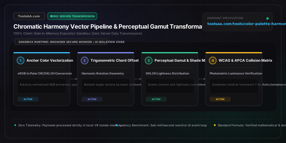
Color Palette Harmony Generator & Schemes Guide — Client-Side In-Memory Architecture & Data Flow

Key Parameters & Controls

Base Hue Angle (θ)CIE Chromatic Angle [0° – 360°]

Angular position on the continuous 360-degree CIE/Munsell chromatic wheel determining primary spectral wavelength (0° Red, 60° Yellow, 120° Green, 180° Cyan, 240° Blue, 300° Magenta). Evaluated in O(1) trigonometric time as the origin coordinate for harmonic rotations within the sandboxed browser V8 runtime.

Default: 240° (Royal Blue)
Geometric Angular Offset (Δθ)Trigonometric Chord Interval

Geometric angular displacement establishing classical harmony topologies: Complementary (180°), Triadic (120° / 240°), Analogous (±30° / ±60°), Split-Complementary (150° / 210°), and Tetradic (60° / 180° / 240°). Calculated modulo 360° via pure mathematical rotation with zero external dependencies.

Default: 180° (Complementary)
Perceptual Lightness (L*)CIE L* / OKLCH L [0.00 – 1.00]

Perceptually uniform brightness scale from 0.0 (absolute absorption black) to 1.0 (pure diffuse white). Prevents yellow/blue perceptual lightness spikes inherent to raw HSL, ensuring colors with equal L values share identical human perceived brightness across all hues.

Default: 0.55
Chroma / Saturation (C*)OKLCH Chroma [0.00 – 0.37] / Purity Metric

Radial distance from the achromatic neutral gray axis toward the spectral locus. High chroma (>0.20 in OKLCH, >80% in sRGB) induces eye fatigue and chromostereopsis; accessible UI surfaces require restrained chroma (<0.08) while interactive controls target 0.12–0.18.

Default: 75% (0.18 OKLCH)
WCAG Relative Luminance (Y)Linearized Photometric Ratio [0.00 – 1.00]

Linearized photometric brightness calculated as Y = 0.2126R_lin + 0.7152G_lin + 0.0722B_lin per W3C WCAG 2.1 §1.4.3. Dictates contrast ratio (L1 + 0.05) / (L2 + 0.05), mandating ≥4.5:1 for standard text (AA) and ≥7.0:1 for enhanced legibility (AAA).

Default: 0.21
Color Space Transformation EngineIEC 61966-2-1 sRGB ↔ OKLCH / Display-P3

Client-side matrix transformation pipeline executing 3x3 matrix convolutions: gamma expansion [0, 255] ➔ linear sRGB ➔ CIE XYZ (D65 illuminant) ➔ LMS cone space ➔ OKLCH polar coordinates. Executes in deterministic O(1) time complexity within the browser execution isolate without server telemetry.

Default: OKLCH (W3C Color 4)

Pro Tips & Best Practices

Defeat Helmholtz-Kohlrausch Perceptual Distortion

Standard HSL math treats 100% saturated yellow (L=50%) and 100% saturated blue (L=50%) as equal lightness, but human photopic eye response perceives yellow as dramatically brighter. Always switch to OKLCH perceptual color space when balancing text readability against background swatches; identical L values in OKLCH guarantee uniform perceived brightness across all 360 degrees of hue.

Prevent Chromatic Vibration with Neutral Bridges

Placing high-saturation complementary colors (e.g., pure red #FF0000 and pure cyan #00FFFF) directly adjacent triggers physiological lateral inhibition, conflicting accommodation, and eye strain. Insert a neutral bridge (a tint with Chroma < 0.02 or a dark surface with L < 0.20, ensuring a luminance difference ΔY ≥ 0.30) between saturated complementary pairs.

Enforce the 60-30-10 Design Allocation Rule

Never allocate harmonic palette colors in equal proportions. Apply 60% of canvas area to the dominant neutral/surface color, 30% to the secondary structural brand hue, and reserve the remaining 10% strictly for the accent/complementary action color (buttons, badges, active states).

Validate Color Vision Deficiency Collisions

Approximately 8% of men and 0.5% of women have Deuteranopia or Protanopia. Complementary red-green palettes collapse into indistinguishable brownish-yellow hues under dichromatic vision. Always ensure a minimum 3.0:1 luminance difference between critical status states, not color hue alone, and reinforce with typography or icons per WCAG 2.1 SC 1.4.1.

Harvest Web Crypto API Hardware Entropy for Exploratory Schemes

Standard Math.random() relies on pseudo-random PRNG engines susceptible to state recovery and modulo clumping around popular hue quadrants. For unbiased exploratory palette generation, harvest hardware entropy via the Web Crypto API using window.crypto.getRandomValues(new Uint32Array(1)) / 4294967296 * 360, guaranteeing uniform distribution across the entire 360° CIE spectrum.

Common Gotchas & Troubleshooting

⚠️Generated complementary palette fails WCAG AA contrast against white or dark backgrounds

Complementary hues share chromatic tension, not luminance compatibility. Adjust the perceptual lightness (L*) slider of the foreground accent hue down to ≤0.35 for white backgrounds, or up to ≥0.75 for dark charcoal backgrounds to achieve the mandatory 4.5:1 ratio.

⚠️Intermediate gradient steps and analogous colors look muddy, dirty, or gray

Linear RGB interpolation cuts through the desaturated core of the color cylinder. Switch the generator's calculation space from sRGB/HSL to OKLCH; this curves interpolation through constant perceived chroma and eliminates gray dead-zones.

⚠️Colors shift or clip when exporting CSS to wide-gamut Display P3 or printing to CMYK

High-chroma synthetic RGB values (such as neon cyans and greens) fall outside the sRGB triangle or CMYK print gamut. Use the Gamut Clipping Armor toggle to clamp values to standard sRGB [0, 255] or preview the corresponding Display P3 wide-gamut CSS color(display-p3 r g b) tokens.

⚠️Triadic and tetradic palettes appear chaotic and visually overwhelming in UI cards

Equal saturation across 3 or 4 disparate hues causes competing focal points. Keep only one dominant hue at high saturation (>70%) and deliberately desaturate the remaining secondary and tertiary harmonies to 20-35% chroma to function as supporting tones.

Frequently Asked Questions

How do you calculate complementary, triadic, and analogous color harmonies mathematically?▼

Color harmonies are calculated by converting sRGB values into polar coordinates (Hue θ from 0° to 360°, Saturation, Lightness). Complementary harmony adds 180° (θ + 180° mod 360°). Triadic harmony rotates by 120° increments (θ + 120°, θ + 240°). Analogous harmony calculates adjacent hues at ±30° and ±60° (θ ± 30° mod 360°). Split-complementary takes the base hue θ and pairs it with two angles adjacent to its direct complement: θ + 150° and θ + 210°. All transformations execute in O(1) computational time.

What is the minimum WCAG contrast ratio required for accessible button text and background colors?▼

Under WCAG 2.1 Level AA, standard body text and button labels below 18pt regular (or below 14pt bold) require a minimum contrast ratio of 4.5:1 against their background. Large text (≥18pt regular or ≥14pt bold) and essential graphical UI components (such as button borders, form field outlines, and active tab indicators) require a minimum contrast ratio of 3.0:1. Level AAA elevates standard text requirements to 7.0:1 and large text to 4.5:1.

What is the difference between HSL color mixing and OKLCH perceptual color harmony?▼

HSL (Hue, Saturation, Lightness) is a simple cylindrical transform of raw sRGB that ignores human retinal sensitivity, causing yellow (50% lightness) to appear far brighter than blue (50% lightness). OKLCH is based on CIECAM02 and CAM16 perceptual color models developed by Björn Ottosson; it separates perceived lightness (L), chroma (C), and hue (h) uniformly, ensuring two colors with identical L values have identical perceived brightness across all 360 degrees of hue.

Why do complementary colors look muddy or vibrate when placed directly next to each other?▼

Visual vibration (chromostereopsis) occurs when high-saturation complementary colors with identical luminance trigger opposing signals in adjacent retinal cones without sufficient luminance contrast, causing the optical edge to fluctuate. Muddiness occurs during linear RGB alpha-blending because intermediate values drop in perceived chroma toward the dark center of the RGB cube. Remedying this requires adding a luminance delta (ΔL ≥ 0.3) or a neutral divider line.

Does generating color palettes in this tool send private brand hex codes to an external server?▼

No; all mathematical color space conversions (sRGB, CIE XYZ, OKLCH, Display-P3), WCAG contrast formulas, and CVD simulations execute 100% client-side inside your browser's sandboxed JavaScript V8 virtual machine. No hex codes, color values, or uploaded brand assets are ever transmitted across a network, guaranteeing zero server telemetry, complete offline functionality, and total data isolation conforming to enterprise security standards.

Related Tools & Utilities

All Tools →