Short title

CSS Neumorphism Generator & Soft UI Maker

Generate CSS neumorphism and soft UI box shadows with extruded, recessed, flat, and concave surfaces. Copy instant CSS, Tailwind, SCSS, or SVG code.

Lbl presets
Title visual stage
Lbl state extrudedLbl click to toggle
145Unit deg
#e0e5ec
Lbl element size240Unit px
Lbl border radius32Unit px
Lbl elevation distance12Unit px
Lbl blur softness24Unit px
Lbl spread radius0Unit px
Lbl intensity15Unit percent
Lbl incident angle145Unit deg
145Unit deg
Lbl compass studioLbl drag compass hint
Lbl chromatic harmonyLbl chromatic desc
Lbl css variablesLbl css variables desc
Lbl accent rimLbl accent rim desc
Stat vector label dx=10Unit px, dy=7Unit px | 145Unit degStat complexity
/* Neumorphic Soft UI Element */
.soft-ui-surface {
  width: 240px;
  height: 240px;
  border-radius: 32px;
  background: #e0e5ec;
  box-shadow: 10px 7px 24px #b5c3d5, -10px -7px 24px #e5e9ee;
  transition: box-shadow 0.2s cubic-bezier(0.4, 0, 0.2, 1), transform 0.15s ease;
}
/* Interactive Elevate & Depress States */
.soft-ui-surface:hover {
  box-shadow: 13px 9px 30px #b5c3d5, -13px -9px 30px #e5e9ee;
  transform: translateY(-2px);
}
.soft-ui-surface:active {
  box-shadow: inset 10px 7px 24px #b5c3d5, inset -10px -7px 24px #e5e9ee;
  transform: translateY(0);
}
Lbl format active Tab vanilla | 569 Unit bytesStat production ready
Stat card1 title
1.41Unit ratio

Stat card1 warn

Stat card2 title
145Unit deg / 12Unit px

Stat card2 desc

Stat card3 title
24Unit px (Lbl auto physics)

Stat card3 desc

Client-Side Processing

High-performance calculation executed entirely in browser memory.

Zero Server Upload Privacy

All payloads remain strictly local with zero external server communication.

Production Ready Export

Clean, optimized output formats ready for immediate deployment.
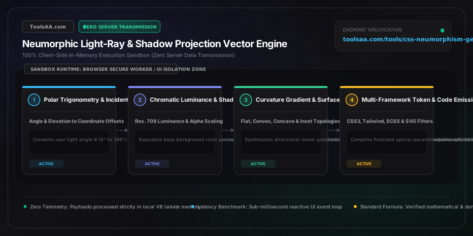
Technical Reference & Architecture Guide

CSS Neumorphism Generator & Soft UI Shadows Guide

Design extruded, inset, and flat soft UI box shadows with our CSS Neumorphism Generator. Copy clean CSS code, adjust light angles, blur, and contrast in real time.

CSS Neumorphism Generator & Soft UI Shadows Guide — Client-Side In-Memory Architecture & Data Flow

Key Parameters & Controls

surface_colorhex / hsl color string

Base chromatic container background matching the parent canvas. Lightness boundaries between 80% and 94% in light mode (e.g., #e0e5ec) or 10% and 20% in dark mode provide optimal optical shadow distinction without clipping specular highlights or crushing ambient dark shadows.

Default: #e0e5ec
shadow_distancepixel integer (2px - 50px)

Spatial coordinate offset in pixels representing perceived z-axis elevation from the canvas plane. Optical physics dictates that realistic natural daylight casting requires the blur radius to maintain a 2:1 ratio relative to distance.

Default: 12px
blur_radiuspixel integer (4px - 100px)

Gaussian penumbra diffusion radius. Ratios below 1.5x distance result in harsh artificial bevels, while ratios exceeding 3.0x distance cause excessive shadow washout and loss of tactile edge definition.

Default: 24px
light_angleangular degree (0deg - 360deg)

Polar incident light vector. Standard human interface ergonomic guidelines establish 135deg to 145deg (top-left illumination) as the primary baseline, matching natural reading direction and standard overhead lighting expectations.

Default: 145deg
shadow_intensitypercentage (5% - 40%)

Alpha channel multiplier scaling shadow darkness and highlight luminescence. High values (>30%) increase dramatic depth but cause visual fatigue and trigger 8-bit sRGB color banding on uncalibrated consumer monitors.

Default: 15%
surface_shapeelevation profile enum (flat | concave | convex | pressed)

Geometric surface topology: Flat (pure dual box-shadow), Concave (inward linear gradient along the light axis), Convex (outward spherical linear gradient), or Pressed/Inset (dual internal shadows for depressed buttons and input fields).

Default: flat

Pro Tips & Best Practices

Chromatic Shadow Harmonization vs Dirty Gray Sludge

Pure black rgba(0, 0, 0, alpha) shadows on colored pastel backgrounds create an unappealing, muddy gray optical artifact. Professional soft UI applies chromatic shadow tinting by shifting the dark shadow's hue toward the base surface hue while dropping lightness by 15-20% and increasing saturation by 5-10% in the LCH or HSL color space.

The 2:1 Blur-to-Distance Golden Physics Ratio

In physical skeuomorphic optics, a point light source creates an umbra and penumbra whose softness scales linearly with elevation. Setting blur = 2 * distance and spread = 0 creates the most authentic organic soft UI look. Setting non-zero spread values often creates harsh artificial rims that ruin the seamless surface illusion.

Solving the Neumorphic WCAG AA Non-Text Contrast Trap

Neumorphic buttons inherently fail WCAG 2.1 Success Criterion 1.4.11 (3:1 contrast ratio for user interface components) because the surface color matches the background. To pass accessibility audits without abandoning the aesthetic, implement a 1px semi-transparent accent stroke (rgba(var(--text-color), 0.15)) or combine the soft shadow with a high-contrast icon/label text that exceeds 4.5:1.

Common Gotchas & Troubleshooting

⚠️Banding artifacts and jagged gradient rings appearing on mobile OLED or 8-bit displays

Subtle gradients and deep soft blurs trigger 8-bit color banding (dither stepping). Fix this by adding a subtle CSS pseudo-element with a 1% SVG monochromatic grain filter (feTurbulence with opacity 0.03) or capping blur radius below 40px while nudging distance down.

⚠️CSS inset box-shadow overlapping inner text or clipping border-radius on Safari WebKit

WebKit sometimes bleeds inset shadows past rounded corners during hardware-accelerated transforms. Ensure the container has overflow: hidden, an explicit border-radius, and an isolated stacking context (transform: translateZ(0) or will-change: transform).

⚠️Neumorphic hover states flickering or causing high CPU reflow during transitions

Transitioning multiple box-shadow properties forces expensive CPU rasterization repaint cycles on every frame. Instead of transitioning box-shadow directly, cross-fade two absolutely positioned pseudo-elements (::before and ::after) using opacity transitions with will-change: opacity, achieving smooth 60fps GPU-composited transitions.

Frequently Asked Questions

How do you calculate CSS neumorphic box shadows mathematically?▼

Neumorphic CSS shadows require two complementary box-shadow declarations derived from polar light coordinates (theta) and distance (d): offset-x = d * cos(theta), offset-y = d * sin(theta). The opposing specular highlight applies (-offset-x, -offset-y) with a color lightened by 10-20% relative to the surface backdrop, while the ambient shadow applies (+offset-x, +offset-y) darkened by 10-25%, paired with a Gaussian penumbra blur radius calibrated to exactly 2 * d.

What is the best background color for neumorphic UI design?▼

Mid-tone off-whites and soft slates with lightness values between 88% and 94% (specifically hex #e0e5ec, #ebecf0, or HSL 215, 20%, 91%) offer the optimal dynamic range for neumorphism. Pure white (#ffffff) fails because specular highlights clip without visible contrast, whereas pure black (#000000) crushes ambient dark drop shadows into zero visibility.

What is the difference between neumorphism, glassmorphism, and skeuomorphism?▼

Neumorphism extrudes single-colored surfaces from their parent background using dual opposing soft box shadows, whereas glassmorphism relies on multi-layer translucent panels with background blur (backdrop-filter: blur()), and skeuomorphism renders hyper-realistic real-world textures (leather, brushed aluminum, physical bevels) with intricate specular gradients and 3D lighting models.

Why does neumorphic UI fail WCAG 2.1 AA accessibility contrast audits?▼

Neumorphic controls fail WCAG 2.1 Success Criterion 1.4.11 (requiring a 3:1 contrast ratio for user interface components) because the clickable element surface shares an identical 1:1 hex color with the canvas backdrop. To achieve regulatory compliance without discarding soft UI, architects inject a 1px semi-transparent boundary border (rgba(0, 0, 0, 0.15)) or ensure interactive typography and iconography independently achieve a 4.5:1 contrast ratio against the background under WCAG Criterion 1.4.3.

Related Tools & Utilities

All Tools →