Short title

CSS Box Shadow Generator & Smooth Shadows

Generate multi-layer CSS box shadows and realistic smooth elevation. Customize offset, blur, spread, inset glow, and export clean CSS or Tailwind shadow tokens.

Lbl quick pill

Harmonic title

Lbl light angle (90Unit deg)
Lbl compass presets
Lbl layers count:
Lbl distance50Unit px
Lbl max blur80Unit px
Lbl spread-5Unit px
Lbl opacity25Unit percent
Lbl contact ratio60Unit percent
Lbl tint chromaNeutral
Lbl subpixel border
Lbl curveCurve cubic
Lbl target:
Lbl backdrop:
Sample card badgeSample card version

Sample card title

Sample card desc

Sample card price
Stat active layers
6 / Max layers count
Stat layers sub
Stat total blur
180Unit px
Stat blur sub
Stat raster rating
60 Unit fps Lbl gpu ok
Stat cost sub
Technical Reference & Architecture Guide

CSS Box Shadow Generator & Smooth Shadows Guide

Generate multi-layer CSS box shadows and realistic smooth elevation. Customize offset, blur, spread, inset glow, and export clean CSS or Tailwind shadow tokens.

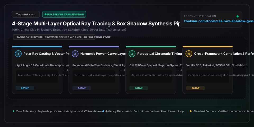
CSS Box Shadow Generator & Smooth Shadows Guide — Client-Side In-Memory Architecture & Data Flow

Key Parameters & Controls

offset-x (Horizontal Displacement)Length (px)

Specifies the horizontal Cartesian displacement of the shadow relative to the element box. Positive values cast the shadow to the right; negative values cast it to the left. In multi-layer lighting models, offset-x is derived as dx = distance * cos(theta), where theta represents the incident light source angle.

Default: 0px
offset-y (Vertical Displacement)Length (px)

Specifies the vertical Cartesian displacement of the shadow. Positive values cast the shadow downward (mimicking natural overhead sunlight or ceiling luminaire illumination); negative values cast it upward. Standard physical elevation models scale offset-y proportionally with perceived Z-axis elevation.

Default: 4px
blur-radius (Gaussian Dispersion)Length (px)

Defines the standard deviation parameter for the Gaussian blur filter kernel applied to the shadow perimeter (sigma = blur / 2). A blur radius of 0 yields a razor-sharp hard silhouette; values above 0 create a diffuse penumbra gradient. Values exceeding 64px can cause GPU rasterization bottlenecks on low-powered mobile devices.

Default: 12px
spread-radius (Perimeter Dilation / Contraction)Length (px)

Expands or contracts the shadow geometry in all four directions prior to Gaussian blur rasterization. Positive values dilate the shadow perimeter outward; negative values contract the shadow inward, a critical technique in multi-layer shadows to prevent lateral edge bleeding while preserving deep vertical grounding.

Default: -2px
color & alpha (Chromatic Absorption & Opacity)Color (HEX / RGBA / OKLCH)

Specifies the spectral color and opacity of the cast shadow. Pure black (rgba(0, 0, 0, alpha)) represents uncalibrated absorption, which produces muddy gray fringes on colored backgrounds. Professional design tokens utilize tinted hues (e.g., deep navy for cool surfaces or dark umber for warm surfaces) calibrated between 4% and 25% alpha.

Default: rgba(0, 0, 0, 0.08)
inset (Internal Surface Well)Keyword Flag

When present, inverts the projection vector to render the shadow inside the element border-box rather than casting externally. Inset shadows simulate debossed wells, concave indentations, inner bevel highlights, and pressed physical button states, correctly clipped by the element border-radius curvature.

Default: false (outer)
harmonic falloff curve (Inter-Layer Easing)Mathematical Exponent (k)

The polynomial or exponential power-law exponent (typically k = 1.8 to 2.4) governing how displacement distances, Gaussian blur radii, and alpha opacity scale across consecutive layers in a multi-layer stack. Prevents unnatural linear stepping and emulates realistic optical inverse-square light dissipation.

Default: 2.0 (quadratic)

Pro Tips & Best Practices

Negative Spread Radius Prevents Lateral Edge Bleeding on Cards

When applying large vertical shadows (e.g., offset-y: 20px, blur: 25px), the Gaussian blur automatically spills outward horizontally to the left and right, creating an unnatural bloated pillowy appearance. By introducing a negative spread radius equal to roughly 20% to 40% of the vertical offset (e.g., spread: -6px), you pull the lateral sides inward while preserving strong downward grounding, producing clean, crisp vertical elevation.

Animate Pseudo-Element Opacity Instead of Box-Shadow for 60fps Performance

Directly transitioning or animating the CSS box-shadow property forces the browser rendering engine to re-rasterize heavy multi-pass Gaussian blur kernels across CPU and GPU paint layers on every single animation frame, causing severe jank and dropped frames during hover. Instead, declare the elevated shadow on an ::after pseudo-element with opacity: 0 and will-change: opacity, then animate only opacity: 1 and a hardware-accelerated transform: translateY(-2px) for silk-smooth 120fps GPU compositor transitions.

Prevent Muddy Gray Boundaries by Tinting Shadow Hues to Match Canvas Tone

Using neutral black shadows (rgba(0, 0, 0, 0.15)) over colored surfaces like warm amber, emerald green, or deep sapphire creates perceptually dirty, desaturated gray halos along the blur perimeter due to sRGB gamma blending. To achieve radiant high-end depth, derive shadow hues by shifting the background color hue 10° to 20° toward a complementary cool tone, increasing saturation by 15%, and dropping lightness to 8%-15%.

Common Gotchas & Troubleshooting

⚠️Box shadow is clipped or completely invisible around the card perimeter

If an ancestor container has overflow: hidden or overflow: auto declared, any box-shadow extending outside the container bounding box will be clipped immediately. Resolve this by adding sufficient padding to the parent container (at least equal to blur + offset-y), removing overflow: hidden, or applying the shadow to an insulated wrapper div positioned outside the scroll container.

⚠️Multi-layer box shadow triggers frame drops and high GPU memory usage during scroll

Stacking more than 6 complex shadow layers with blur radii exceeding 60px consumes significant GPU tile cache memory, especially on high-DPI Retina screens. Optimize by reducing layer count to 3 or 4 carefully calibrated harmonic layers, capping maximum blur at 40px, and adding contain: paint or will-change: transform to promote the elevated card to an isolated hardware compositing layer.

⚠️Jagged stair-stepping or antialiasing seams appear on rounded card corners in Safari WebKit

WebKit displays a documented subpixel antialiasing bug when rendering combined outer border-radius and inset box-shadows. Fix this by explicitly setting -webkit-mask-image: -webkit-radial-gradient(white, black), adding transform: translateZ(0), and ensuring border-radius values use whole pixel integers rather than fractional rem decimals.

⚠️Box shadow does not match the transparent silhouette of a PNG or SVG icon

The CSS box-shadow property calculates projection exclusively against an element's rectangular border-box and border-radius curvature, completely ignoring internal transparent pixels. To cast a shadow that conforms to transparent PNG cutout edges or complex SVG vector paths, replace box-shadow with CSS filter: drop-shadow(x y blur color), noting that filter: drop-shadow does not accept spread or inset arguments.

Frequently Asked Questions

Why do multi-layer CSS box shadows look more realistic than single-layer shadows?▼

Single-layer CSS box shadows rely on a uniform linear Gaussian blur that fails to replicate real-world optics. In physical environments, an illuminated object casts two distinct shadow zones: a dark, razor-sharp contact umbra directly beneath the base (ambient occlusion) and a broad, soft, low-contrast penumbra diffusing outward. Stacking 3 to 6 box-shadow layers with exponential distance and blur falloffs (e.g., y_i = d * (i/n)^2.2, blur_i = b * (i/n)^2.0, alpha_i = alpha_max * e^(-0.6i)) faithfully simulates both ambient occlusion and volumetric light dissipation.

What is the difference between CSS box-shadow and filter: drop-shadow()?▼

CSS box-shadow applies strictly to an element's rectangular border-box (including border-radius), ignoring internal transparency and pseudo-elements. In contrast, filter: drop-shadow() evaluates the actual alpha channel mask of rendered pixels, casting shadows around transparent PNG contours, inline SVG paths, and CSS clip-path shapes. However, filter: drop-shadow() does not support the spread-radius parameter or the inset keyword, and multiple drop-shadow filters incur heavier GPU compositing overhead.

How do you prevent dirty gray shadows on colored backgrounds in CSS?▼

Pure black shadows (rgba(0, 0, 0, 0.15)) over non-neutral surfaces produce a muddy, desaturated gray boundary because sRGB alpha blending washes out background chroma. To produce rich, vibrant shadows, sample the background hue, shift it 10°–20° toward a deeper complementary tone (e.g., shift an orange background toward deep reddish umber, or a blue background toward midnight navy), increase saturation by 15%–30%, and decrease lightness to 10%–20%. In modern CSS, this can be automated via color-mix(in oklch, var(--bg-color), black 80%).

How do you optimize CSS box-shadow for 60fps animations without causing GPU lag?▼

Never animate the box-shadow property directly; doing so forces the browser's CPU and GPU to re-rasterize heavy Gaussian blur matrices on every frame (triggering costly Paint and Composite steps). Instead, render a persistent ::after pseudo-element with the elevated box shadow pre-rendered, set its initial opacity: 0, and animate opacity and transform: translateY(-2px) on :hover or :focus. Because opacity and transform run entirely on the GPU compositor thread without triggering layout or paint, animations achieve rock-solid 60fps/120fps with zero frame drops.

What is the ideal box-shadow elevation scale for design systems?▼

Standard design systems (such as Material Design, Tailwind CSS, and Apple HIG) structure shadows into a 5-to-6 tier Z-index elevation scale: Elevation 1 (Card/Button rest: 1-2px Y-offset, 3-4px blur, 5-8% opacity for subtle separation), Elevation 2 (Card hover/Raised button: 4-6px Y-offset, 8-12px blur, 10-12% opacity), Elevation 3 (Dropdown menu/Popover: 8-12px Y-offset, 16-24px blur, 12-15% opacity), Elevation 4 (Modal dialog/Drawer: 16-24px Y-offset, 32-48px blur, 15-20% opacity), and Elevation 5 (Toast/Floating system alert: 24-32px Y-offset, 48-64px blur, 20-25% opacity with ambient perimeter glow).

Does CSS box-shadow affect page layout or trigger reflow?▼

No, box-shadow does not affect document layout, does not increase an element's bounding box dimensions, and does not trigger DOM reflow or layout recalculations when applied or toggled. However, because box shadows render outside the element's box model, very large blur or spread radii will overlap adjacent elements, potentially obscuring text or causing horizontal scrollbars if the shadow extends beyond the viewport width (unless contained by overflow: hidden).
Related Tools & Utilities

All Tools →